Contemporary Typographic Design: Sovereign Glyphs of the Modern Era
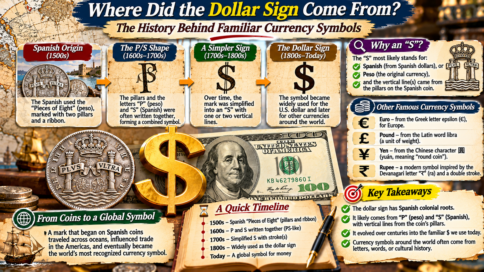
While most global currency symbols evolved organically through centuries of messy scribal contractions and merchant handwriting shortcuts, the Euro symbol (€) and the Indian Rupee symbol (₹) represent a radical departure: they were deliberately engineered in the modern era through institutional design competitions.
Both glyphs blend profound classical cultural heritage with rigorous geometric ergonomics, created to project economic stability, continental unity, and effortless digital legibility across worldwide computing keyboards and smartphone operating systems.
🪙
Part I: Engineering the Euro
The Creation of the Euro Symbol (€): The Search for European Solidarity
When the European Commission prepared to launch the single European currency in the mid-1990s, it confronted a monumental branding challenge. The new currency required an official graphic symbol that could stand proudly alongside the established titans of global commerce: the American dollar ($) and the British pound (£). However, unlike national symbols, the Euro glyph could not favor the language, script, or national iconography of any single member state. It had to be unmistakably European, instantly recognizable, easy to draw by hand in a single stroke, and aesthetically harmonious with modern Latin typography.
In 1995, the European Commission conducted an anonymous internal design competition. A specialized creative team evaluated more than thirty candidate designs, narrowing the selection to a final shortlist of two prototypes, which were subjected to rigorous qualitative public polling across European member states. The winning design was officially unveiled to the world by European Commission President Jacques Santer on December 12, 1996. While the European Commission officially attributed the design to a collective four-person in-house team, Belgian graphic designer Alain Billiet has widely been recognized as the principal creator of the glyph.
The conceptual architecture of the Euro symbol (€) rests upon three fundamental symbolic pillars. First, its primary curved shape is inspired directly by the Greek letter epsilon (ϵ). By selecting a Greek character, the European Commission paid homage to Greece as the historical cradle of European democracy, philosophy, literature, and Western civilization. Second, the shape forms the initial letter ‘E’, standing for Europe itself. Third, the letter is pierced through its center by two prominent, horizontal parallel bars. These dual crossbars represent absolute monetary stability and the unbreakable economic equilibrium of the Eurozone.
| Engineering Metric | The Euro Symbol (€) | The Indian Rupee Symbol (₹) |
|---|---|---|
| Official Unveiling Date | December 12, 1996 (European Commission) | July 15, 2010 (Union Cabinet of India) |
| Chief Designer / Creator | Alain Billiet & European Commission Team | Prof. D. Udaya Kumar (IIT Bombay / IIT Guwahati) |
| Cultural & Linguistic Roots | Greek letter epsilon (ϵ) + Latin letter ‘E’ | Devanagari letter ‘Ra’ (र) + Roman capital ‘R’ |
| Symbolic Geometry | C-shaped curve with twin parallel stability bars | Horizontal Shirorekha top line + central tricolor stripe |
| National / Regional Identity | European civilization cradle, openness, integration | Indian tricolor flag, national emblem, global digital rise |
| Unicode Assignment | U+20AC (Euro Sign) | U+20B9 (Indian Rupee Sign) |
| Preceding Historic Notation | National currencies (FRF, DEM, ITL) or ‘ECU’ | Rs., Re., R., or regional language scripts (ரூ, రూ, etc.) |
⚖️
Part II: The Euro Grid
The European Commission’s Strict Geometric Construction Matrix
Unlike historic currency symbols that varied wildly depending upon the whims of individual stone engravers and typesetters, the European Commission published a precise, mandatory geometric construction grid for the Euro symbol. The official specifications dictated that the outer contour of the symbol must form an exact mathematical circle with a specific diameter. The two horizontal crossbars were mandated to be parallel, possessing an exact thickness matching the curve, angled precisely at 40 degrees along their terminal cuts, and separated by a strict mathematical ratio relative to the central void.
Furthermore, the European Commission specified that the official corporate color of the Euro symbol must be Pantone Reflex Blue for the background field and Pantone Yellow for the symbol itself, perfectly mirroring the official flag of the European Union. However, this strict geometric rigidity sparked an immediate, furious rebellion among professional typographers and font foundries across the globe. Type designers at Adobe, Monotype, and Linotype pointed out that letters in a font do not exist in mathematical isolation; they must adapt to the optical weight, serif structures, italic slants, and visual rhythm of specific typefaces (such as Times New Roman, Helvetica, or Garamond).
Typographers argued that forcing a rigid, unvarying mechanical circle into an organic, humanistic serif typeface would look grotesque and disruptive on printed pages. Fortunately, practical typography prevailed: while the European Commission’s exact geometric grid remains the mandatory corporate logo for official EU institutions, type foundries were granted full creative freedom to design custom Euro glyphs tailored to the specific optical proportions and artistic style of individual typefaces, resulting in thousands of harmonious digital variations.
🏛️
Part III: The Rupee Competition
The Indian Rupee (₹): Overcoming the Century-Old ‘Rs.’ Dilemma
Fourteen years after the birth of the Euro symbol, the Republic of India executed an equally brilliant modern numismatic branding revolution. The Indian Rupee was one of the oldest currencies in Asia, tracing its linguistic lineage to the Sanskrit word rūpya, meaning ‘wrought silver’ or ‘coined silver,’ popularized during the sixteenth century under Sultan Sher Shah Suri’s legendary silver Rupiya coin. However, in the modern digital era, the Indian Rupee suffered from an acute typographic handicap: it possessed no unique graphic symbol.
In everyday commerce, print media, and international banking, the Rupee was designated using cumbersome Latin text abbreviations such as ‘Rs.’, ‘Re.’, or ‘INR’. This created severe confusion in South Asian trade, as neighboring nations including Pakistan, Sri Lanka, Nepal, Mauritius, and the Seychelles all designated their own independent sovereign currencies as ‘Rs.’ or ‘Rupees’. Furthermore, in a polyglot democracy with twenty-two officially recognized languages, newspapers printed the currency name in diverse regional scripts (such as Devanagari रुपये, Tamil ரூபாய், Telugu రూపాయలు, and Bengali টাকা), diluting national branding in global financial markets.
In March 2009, the Indian Ministry of Finance launched a nationwide public competition to design a unique, permanent symbol for the Indian Rupee. The competition guidelines required that the symbol embody the historical and cultural ethos of India, be simple to hand-write, reproduce cleanly on small digital mobile phone screens, and harmonize with both Indian vernacular scripts and standard Latin characters. Over 3,300 candidate designs were submitted by artists, designers, and citizens from every corner of India.
👑
Part IV: Udaya Kumar’s Synthesis
D. Udaya Kumar’s Design: The Synthesis of Devanagari and Latin
On July 15, 2010, the Union Cabinet of India officially selected the winning design, created by D. Udaya Kumar, a brilliant graphic designer and doctoral scholar at the Industrial Design Centre (IDC) at the Indian Institute of Technology (IIT) Bombay (who was subsequently appointed Head of the Department of Design at IIT Guwahati). Kumar’s winning glyph (₹) is celebrated worldwide as a stroke of pure semiotic genius, seamlessly synthesizing Eastern calligraphic tradition with Western typography.
Kumar’s design begins with the Devanagari script character ‘Ra’ (र)—the foundational letter that spells ‘Rupaya’ (रुपया) in Hindi, Sanskrit, and multiple North Indian languages. Strikingly, Kumar incorporated a vital Latin typographical element: by removing the vertical descender stem of the Roman capital letter ‘R’, the upper bowl and diagonal leg of ‘R’ merge seamlessly with the Devanagari ‘Ra’. This deliberate bilingual synthesis ensures that the symbol is instantly intuitive to billions of citizens who read Devanagari or Latin scripts across South Asia and global markets.
Most profoundly, Kumar engineered two horizontal lines across the top of the symbol. The upper horizontal line is the continuous ‘Shirorekha’ (headstroke)—the characteristic roofline that anchors all Devanagari script words. The second horizontal line is cut through the waist of the character, creating an intentional white void between two parallel strokes. This creates the universal horizontal crossbars of monetary stability while simultaneously forming a subtle graphic representation of the horizontal tricolor bands of the National Flag of India (the Tiranga), with the central white space symbolizing the Ashoka Chakra’s virtue of truth and peace.
📜
Part V: Digital Adoption
Rapid Global Digital Integration: Unicode, Keyboards, and Hardware Adoption
Once a sovereign currency symbol is created in the modern world, the most formidable obstacle is global digital implementation. For a symbol to be typed in an email, calculated in a spreadsheet, or displayed on a smartphone, it must be officially adopted by the Unicode Consortium—the international non-profit corporation based in California that standardizes the digital encoding of all human writing systems. Following intense diplomatic lobbying by the European Union and the Indian government, both symbols secured record-breaking global standardization.
The Euro symbol was assigned Unicode code point U+20AC, while the Indian Rupee symbol was allocated code point U+20B9 in August 2010 (less than a month after its national selection). Tech giants including Microsoft, Apple, Google, and Linux rapidly rolled out system firmware updates and font revisions embedding the new glyphs into core operating systems. Hardware manufacturers redesigned computer keyboards across Europe and India, introducing dedicated shortcut keys (such as AltGr + 4 on Indian keyboards or AltGr + E on European layouts).
Today, the Euro symbol (€) and the Indian Rupee symbol (₹) stand as radiant beacons of modern nation-building through graphic design. Whether glowing on an illuminated electronic foreign exchange ticker in Frankfurt and Mumbai, stamped on high-security polymer banknotes, or clicked by billions of mobile shoppers in digital e-commerce checkouts, these two contemporary symbols demonstrate that graphic design can crystallize the soul, sovereignty, and economic ambition of entire continents into a single timeless stroke.
Key Takeaways: Modern Currency Symbols
Deliberate Institutional Creation: Unlike ancient symbols that evolved by chance, the Euro (€) and Rupee (₹) were engineered through deliberate modern design competitions.
The Epsilon and Stability: The Euro symbol (€) combines the Greek letter epsilon (cradle of democracy) with twin parallel bars signifying economic equilibrium.
Devanagari-Latin Harmony: The Rupee symbol (₹), designed by D. Udaya Kumar, fuses Devanagari ‘Ra’ (र) with Roman ‘R’ and the horizontal stripes of the Indian flag.
Unicode Standardization: Both glyphs achieved rapid worldwide software and keyboard integration (Euro: U+20AC, Rupee: U+20B9), cementing their global status.
Typography in the Digital Era: Rendering Currencies on High-DPI Mobile Screens
A critical engineering dimension that shaped both the Euro symbol (€) and the Indian Rupee symbol (₹) was the strict requirement for cross-platform digital legibility. Unlike eighteenth-century symbols that were designed primarily for engraved copper plates or heavy mechanical typewriters, modern currency symbols must render flawlessly across an astronomical variety of digital screen resolutions—ranging from tiny 16×16 pixel desktop favicon icons and mobile SMS notifications to massive high-DPI 4K retina displays.
Type designers at major font foundries achieved this through sophisticated typographic ‘hinting’ and optical weight adjustments. In the case of Udaya Kumar’s Rupee design, the deliberate gap between the top Shirorekha roofline and the central horizontal stripe was mathematically calculated so that even when rendered in low-resolution 9-point font sizes on entry-level feature phones in rural India, the two horizontal lines would not blur together into an illegible black smudge. Similarly, the open aperture of the Euro curve ensures that the symbol remains crisp and distinguishable from the Latin capital letter ‘C’ across digital banking apps.
Furthermore, both symbols reflect the profound democratization of national branding in the digital age. By integrating the Euro and Rupee symbols directly into universal smartphone operating systems (iOS and Android), international keyboard hardware layouts, and cloud payment gateways, global financial architecture officially recognized the sovereign stature of these two economic superpowers. The symbols stand as timeless monuments of human design, proving that a handful of curved and horizontal geometric lines can capture the soul, cultural pride, and monetary ambition of hundreds of millions of citizens.
The Economic Symbolism of National Sovereignty in Global Financial Markets
Beyond technical typography and computer operating systems, the adoption of an internationally recognized currency symbol acts as a powerful catalyst for geopolitical prestige and foreign exchange market participation. Prior to 2010, the Indian economy had expanded into a multi-trillion-dollar powerhouse of software, manufacturing, and global services, yet its financial contracts were recorded in generic abbreviations that failed to project the distinctive identity of the world’s largest democracy. By enshrining the unique Rupee symbol (₹), India formally joined an exclusive tier of elite global reserve currencies alongside the US dollar ($), the British pound (£), the Euro (€), and the Japanese yen (¥), projecting sovereign monetary confidence to foreign direct investors, credit rating agencies, and multinational corporations.
Similarly, the Euro symbol (€) continues to represent the boldest experiment in supranational monetary solidarity ever attempted by human civilization. Operating across twenty distinct European nations with diverse linguistic traditions, legal systems, and cultural identities, the symbol serves as a shared visual bond that unites over 350 million citizens. Whether stamped on physical polymer banknotes, rendered on credit cards, or traded in trillions of euros of daily international clearing settlements, both the Euro and Indian Rupee demonstrate that modern graphic design is not mere ornamentation—it is the enduring architectural foundation of sovereign economic trust.